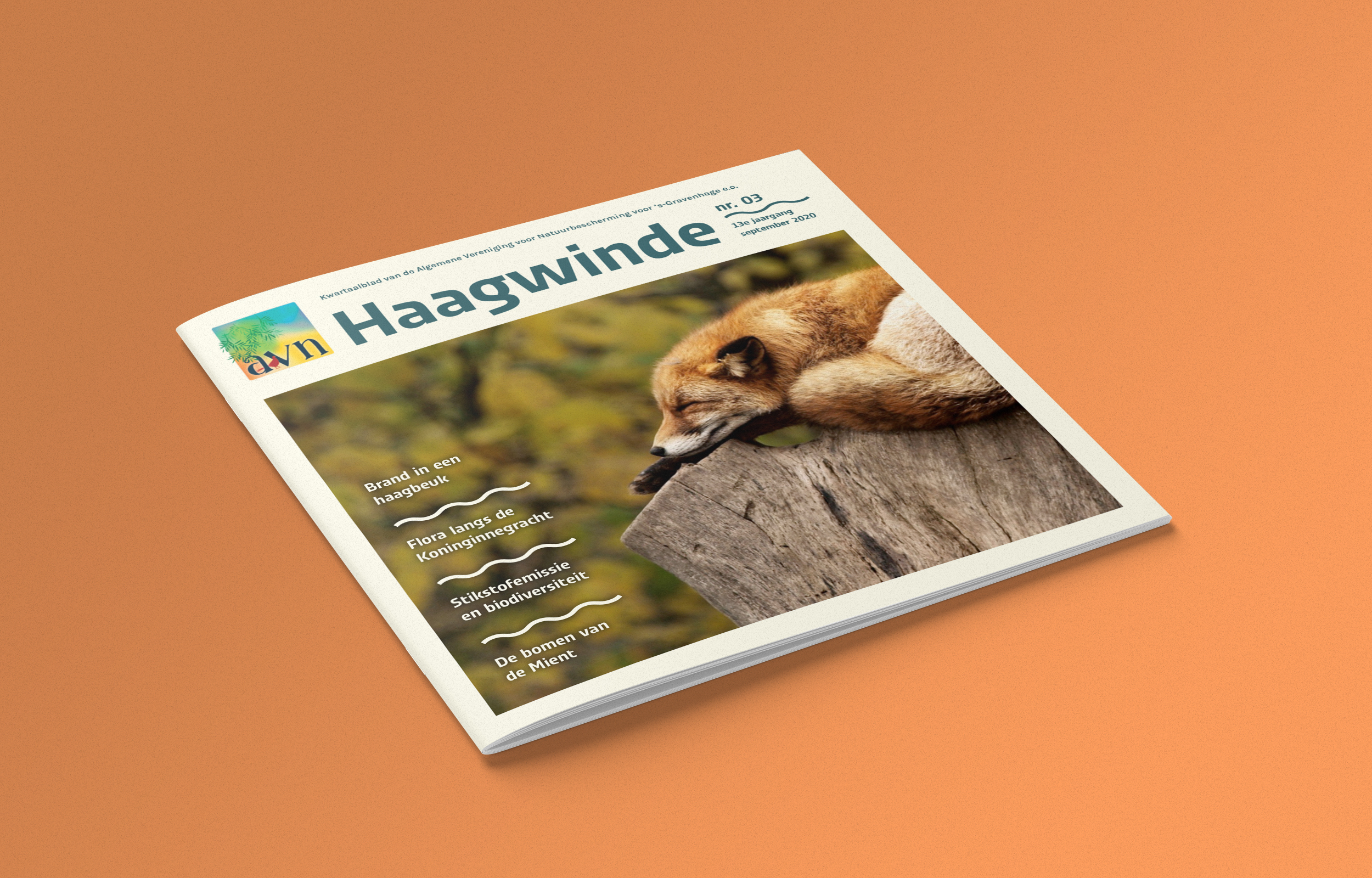
Haagwinde
The quarterly magazine Haagwinde is named after a plant with delicate white flowers. At the same time, like the organsation from which it is issued, it is very hardy and persistent. The aging layout of the Haagwinde was completely redesigned. Clear shapes and surfaces distract less from the content. The curved line, represents an abstracted plant stem that twines around other plants. The new typeface is energetic and organic and fits the character of the organization, which works for nature conservation in The Hague.


